

Brand identity plays a crucial role in shaping how customers perceive a business. For Rosanism, a new floral shop located in the historic city of Barcelona, the objective was to build a visual identity that captures the poetry, elegance, and symbolism of flowers.
Designed by Vordi, the identity combines tradition and modernity, creating a distinctive visual language that reflects the personality of the brand while providing customers with an inspiring and memorable shopping experience.
The project goes beyond a simple logo design. It creates a complete brand universe, extending from the storefront to packaging, printed materials, and customer interaction.
Rosanism was envisioned as a floral brand that celebrates both nature and emotion. Flowers often represent meaningful moments—love, celebration, gratitude, or remembrance—and the identity needed to convey this sense of magic and authenticity.
The visual direction was built around four key principles:
Elegance – reflecting the refined beauty of flowers
Magic – evoking the emotional symbolism behind floral gifts
Tradition – honoring the craft of floristry
Modernity – presenting the brand through contemporary design
This balance creates an identity that feels timeless yet fresh, allowing Rosanism to stand out in a competitive market.
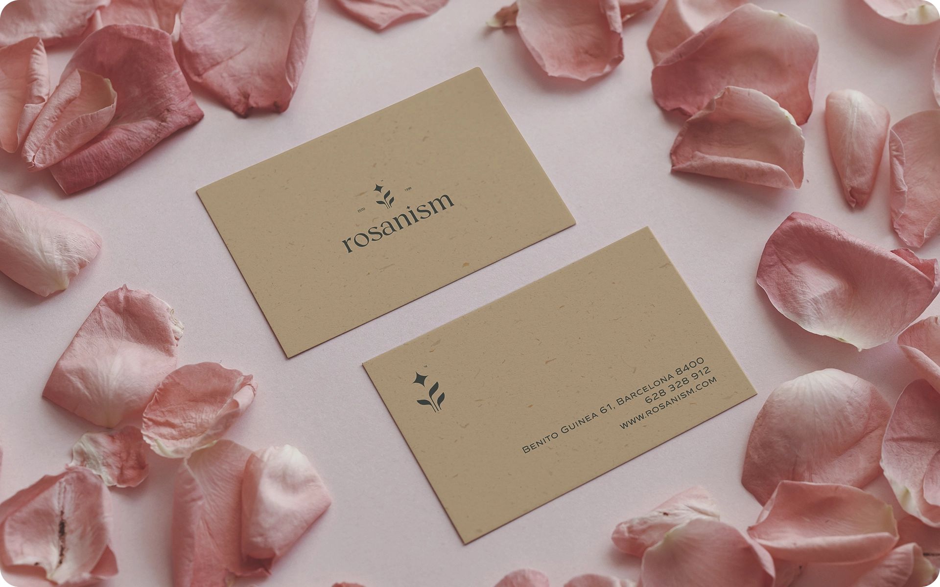
At the center of the brand identity lies the Rosanism symbol, inspired by the natural structure and behavior of flowers.
The design features:
Leaves growing upward, symbolizing life, growth, and renewal
A star above the leaves, representing the sun
A balanced composition that conveys movement toward light
In nature, flowers instinctively grow toward sunlight. This biological phenomenon inspired the concept behind the logo, transforming it into a poetic symbol that represents aspiration, beauty, and vitality.
The result is a mark that feels organic, elegant, and memorable, perfectly aligned with the brand’s philosophy.
Beyond the logo, the project focused on designing a cohesive visual system that shapes every interaction between the brand and its customers.
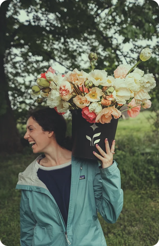
The storefront serves as the first point of contact with the customer. The identity system ensures that Rosanism immediately communicates a sense of refinement, calm, and natural beauty, inviting visitors into the floral experience.
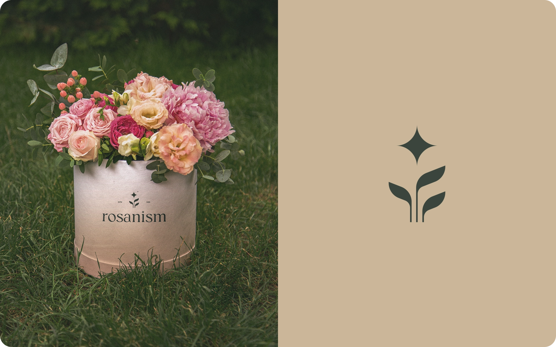
Packaging plays a central role in Rosanism’s brand philosophy. Each bouquet is treated as a unique creation, and the packaging reflects this individuality.
Instead of a single standardized approach, each flower arrangement has its own packaging style, making the experience more personal and meaningful.
This design strategy transforms a simple purchase into a memorable ritual.
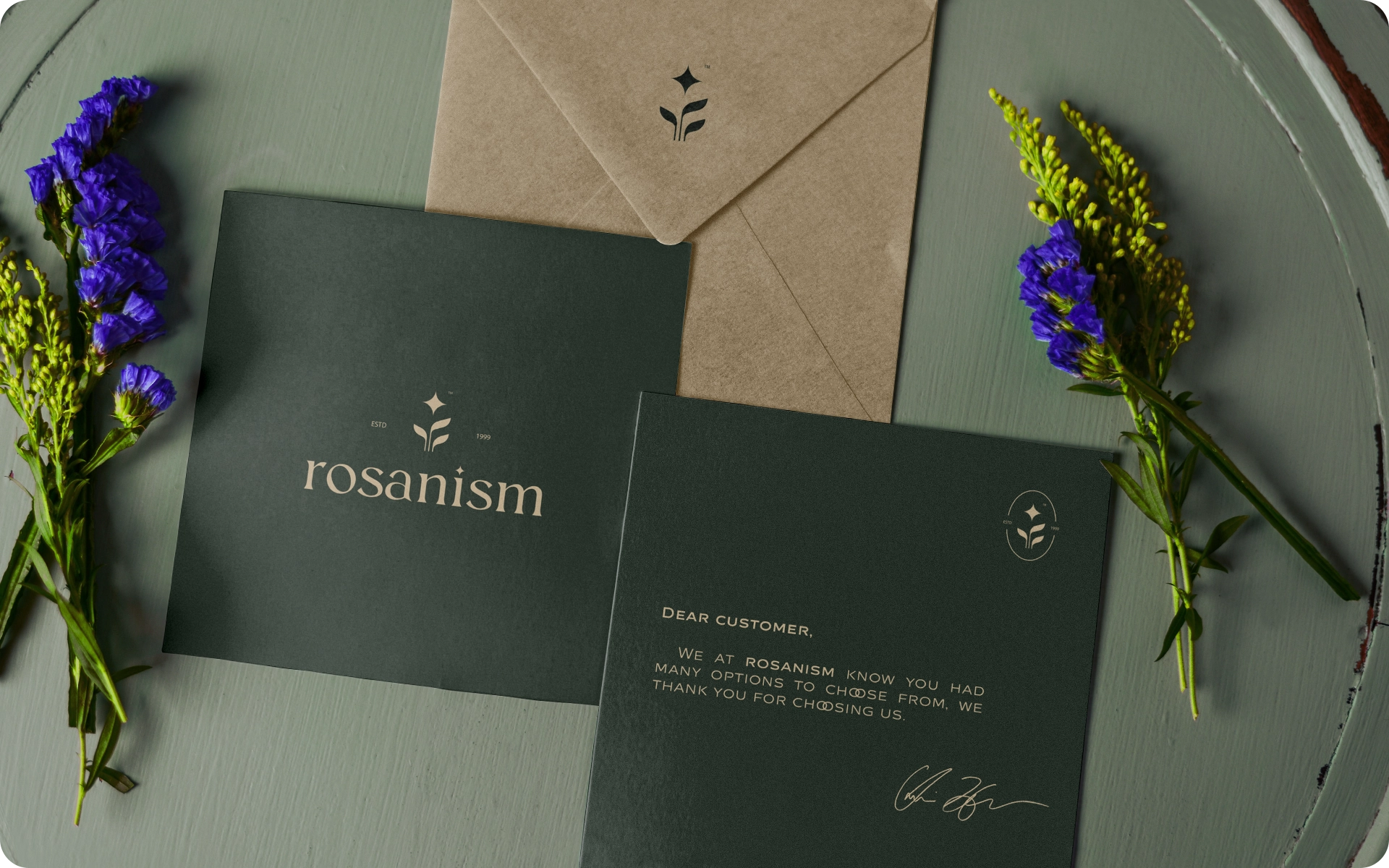
The brand identity also extends to printed elements such as:
thank-you cards – envelopes – product packaging – stationery
These details reinforce the brand’s elegance while strengthening the emotional connection between Rosanism and its customers.
At Vordi, brand identity design is approached as a holistic storytelling process. Every visual element—from typography and color to symbols and materials—works together to create a cohesive narrative.
For Rosanism, the goal was to translate the delicate beauty of flowers into a modern visual language that feels both authentic and memorable.
The result is a brand identity that reflects not only the products being sold but also the emotional experience behind them.